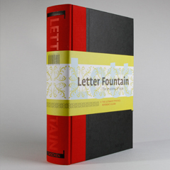
Letter Fountain
The fourth edition of Letter Fountain is written, composed and designed by Joep Pohlen with contributions from Geert Setola.
Red Dot Design award winner 2010 from the Design Zentrum Nordrhein Westfalen and Certificate for Typographic Excellence 2010 from the Type Directors Club New York.
Chapter 1
Contents: the history of writing and typography, the anatomy of the letter, the font family and its parts, characters and their classifications, a comparative study of three sans serif and three serif typefaces, an exposé on measuring systems, digital formats, typographic rules and recommendations, and the choice of a suitable typeface.
Chapter 2
This chapter shows typefaces in weights suitable for text. These typefaces are primary examples to show the great stylistic lines and technical developments in the typographic history. With each of these typefaces six alternatives are presented of similar typefaces.
Appendix
The Appendix is comprehensive and printed on tinted paper. Besides an extensive general index there are alphabetical indexes of typefaces, type designers and foundries. In the foundries index several examples of type specimen are shown. The timeline of major foundries from 1450 until today give an impression of when those foundries existed with their most productive periods. An extensive glossary (dictionary) and a bibliography closes off the Appendix.
Typometer
A typometer is included as a bookmark. This typometer shows four measurement systems and their conversion factors. Also on the typometer hidden signs of the Mac keyboard together with the according keystrokes.
Size: 17 x 24,5 cm, 640 pages, printed in two colors, two paper stocks for the interior, binding hard cover with three ribbons.
Visit www.letterfountain.com for the educational website and an impression of the contents.


